The true gems of being a nerd and researching anything are those moments where you find a bizarre connection that you absolutely never expected and which completely blows your mind. It happens fairly often in the Disneysphere, I think, because over the years the company has employed so many creative and technical personnel who have led long and prolific careers. Or just because life is random, like the fact that the director of Mary Poppins had a daughter who dated Elvis. Whatever the reason, sometimes we’re fortunate enough to find fascinating connections.
So what amazing connection could link this…
To this?
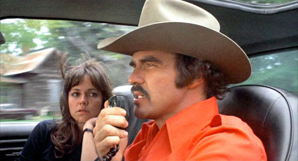
Well, I’ll tell you.
One of the most notable, subtle, and much-missed aspects of the original Epcot Center was its overall aesthetic. Carefully crafted down to the minutest detail, the park’s art design presented a grand and unified statement which tied the individual pavilions and attractions into a thematic whole. Fonts, logos, and signage were consistent throughout the park, giving the entire enterprise a sleek, clean, and futuristic feel. While each pavilion would have its own visual style, and its own specific logos, it would still fit into the overall color design and visual vocabulary of the entire park. This gave all of early Epcot a very comforting vibe, absent of visual contradictions and with a consistent sense of place.
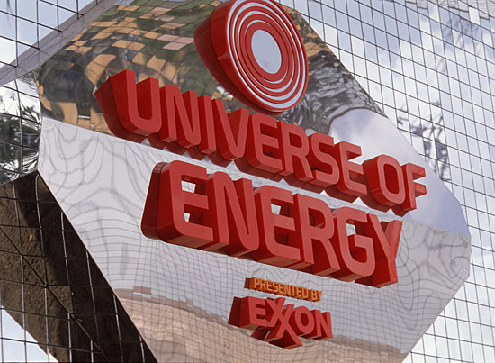
That feeling you’re feeling is the comforting feeling of all-encompassing awesome.
This also meant that very little of Epcot Center’s decor came “off the rack”; everything from large marquees and directional signs to stationary and restaurant menus had to be specifically designed to fit into the park’s distinct look. Signs and printed collateral used a single set of approved fonts and styles, and everything felt “Epcot” whether it was a Japanese teppanyaki menu or a postcard for Horizons.
To accomplish the rather daunting task of decorating the massive new park, Imagineering’s graphics department grew to an unprecedented size and handed out assignments to a slew of designers. Years of input, discussion, and revision ensued prior to the park’s opening. In the end, specific artists were put in charge of individual tasks. One might be responsible for directional signage in the Germany Pavilion, for instance, or for bathroom signage, or parking lot graphics, or paper napkins and cups for each individual restaurant. Someone designed binders for attraction instruction manuals; someone designed safety procedure signs. Everything in Epcot with either words or pictures, on-stage or off, crossed some designer’s desk.
Of course, while every little detail mattered to the whole, some projects were bigger than others. One of the notable Epcot design elements were the iconic logos which represented each pavilion in Future World:
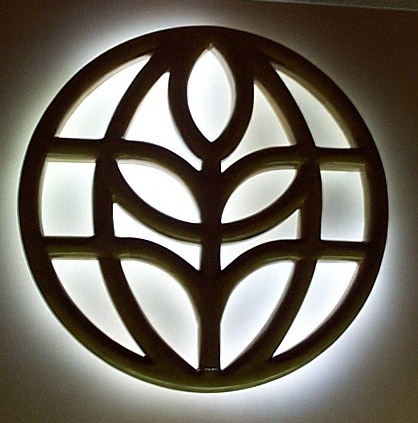
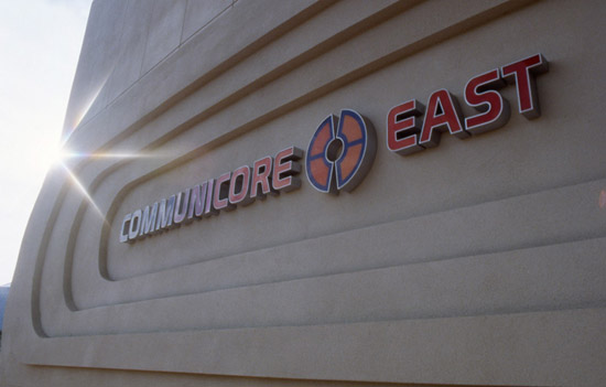
In the run-up to Epcot Center’s opening, responsibility for these logos was given to designer Norm Inouye, of the Imagineering graphics department. Inouye had several high-profile design projects in the final days of Epcot’s creation; he was in charge of a number of signage projects, the marquees for the Imagination Pavilion’s Magic Eye Theatre and ImageWorks, and many graphics throughout CommuniCore including these signs:
He even worked on this beauty, the original and much-loved fountain which once graced the entrance to the park:
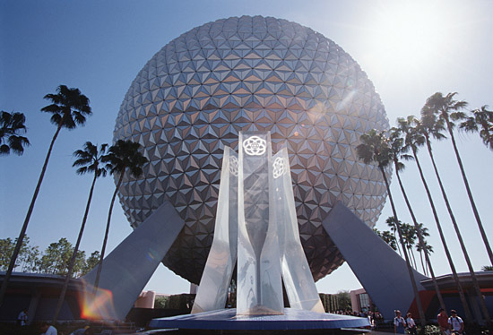
So, pretty impressive resume all around for Mr. Inouye. Now, meanwhile, about 20 years earlier…
In 1959, future Epcot sponsor General Motors produced a turbine-powered concept car, the Firebird III. The vehicle’s designer, Norm James, based its hood emblem on a stylized firebird design he had seen in the Phoenix airport. The car was fairly spectacular:
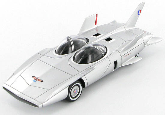
Vroom.
About a decade later, in 1967, the first production Pontiac Firebirds rolled off the assembly line (under the auspices of none other than John DeLorean). A souped up version of the Firebird, the Trans Am, debuted in 1969; both cars featured a small emblem reminiscent of the original Firebird III. In the meantime, another General Motors concept, 1969’s Banshee II, had appeared with a firebird logo designed by none other than… Mr. Norm Inouye.
Inouye worked for General Motors Graphics from 1968-1971. In 1970, designer Bill Porter approached Inouye in the company cafeteria with an idea for a new graphic to grace Trans Am hoods. “Hey, Norm,” Porter later recalled asking, “how about doing a big huge bird for us, something like this?” Porter sketched out an idea on a napkin, which Inouye took and developed into a rather iconic firebird – the “screaming chicken” – which would remain a muscle car staple for years to come.
But first they had to sell it. At the time, G.M.’s vice president of design was Bill Mitchell, with whom we’ve visited previously on the site. He was known to walk through the various design departments to keep abreast of new doings, and one day happened to stroll through the paint department. By that time, Inouye had sent his designs to 3M, who created two large prototype firebird decals for the new 1970 Trans Am show cars. Mitchell, who had something of an aversion to splashy design as well as a touchy temperament, furiously called up Porter and, claiming the decals made it look like the cars had “an Indian blanket on the hood”, ordered them removed immediately.
In was only in 1973 that Porter’s successor, John Schinella, was able to revisit the concept and convince Mitchell to use the firebird design. It debuted as an optional graphics package that year; for the low, low price of $53, Trans Am buyers could have their own flaming avian rampant. Of course it was the second generation 1977 Trans-Am Special Edition which starred in Smokey and the Bandit, and guaranteed that the “screaming chicken” would be a fixture on toy cars throughout the era in which I grew up.
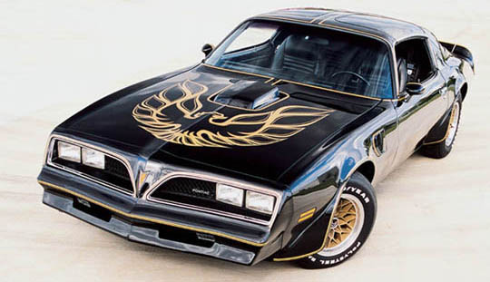
Although I always preferred the General Lee.
Of course the Trans Am would continue to evolve; its third generation design starred in Knight Rider, a more critical staple of my childhood. And, naturally, its Pontiac brethren would grace the halls of the TransCenter in Epcot’s World of Motion pavilion for years afterward. Unfortunately, the Bandit never teamed up with David Hasselhoff and Leonardo da Vinci for a Walt Disney World adventure, but I guess Epcot was already cool enough as it was.



[…] Instamatic – Holiday Hidden Images at Disney’s Hollywood Studios – Ice Disks the EPCOT / Smokey and the Bandit Connection – Thanksgiving Pin Ups Trader Sam’s Enchanted Tiki Bar Gets in the Spirit of Holiday […]
[…] In another blog post about weird connections… Smokey & The Bandit and The Figment… […]
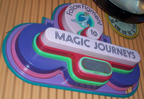
The “Follow Figment” sign still exists. It’s in an office in the North Service Area.