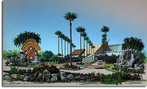
Tiki Talk has posted this intriguing artwork, which was found, of all places, at a flea market. Apparently the artist made a living in the 1980s doing renderings for architectural firms; he produced this work for a Houston company that was bidding on the contract for a mid-’80s refurb of the Polynesian Resort at Walt Disney World. Obviously, the firm’s proposal was not selected.
I kind of dig this design. I would make some changes – substituting tikis in for the Moai for one – but overall I find the effect far more pleasing than the resort’s current entrance. I like the wide-open layout and the use of greenery, rockwork and moving water. It’s a far more impressive approach than the current design, which routes cars through an inauspicious entrance into a rather unappealing parking lot. It’s not really an atmospheric way to arrive at a “deluxe” resort, especially one whose theming in general is quite appealing and immersive. The design in this artwork is far more welcoming and grand.
And I really dig that sign treatment, too.


Nice find! Thanks for sharing.
All Star Polynesian Village!
Just kidding, but you got to admit it has the 90s bigger is better going. Still a great find and yea thanks for sharing. Call me Elmer Fuddy duddy, but in most ways I like the feel of the more reserved secluded entrance. The parking lot is nothing special, but the down to earth lobby entranceway …under the monorail over the bridge through the foliage… oh man I’m there.
One more tiny thing to ponder, the design of the Disney logo, it seems a little more current than the 80’s? Or is it just the season of the wabbit.
[…] the 1980s, according to a post by Michael Crawford on Progress City U.S.A., Tiki Talk posted artwork, that he produced, for a Houston architectural firm of a possible remodel […]
[…] Crawford at Progress City USA shares an amazing Polynesian find. And speaking of Polynesia, he editorializes on the Enchanted Tiki Room […]