Once upon a time, ibis-crazed visitors to Walt Disney World could visit Discovery Island – a relaxing tropical hideaway in the center of Bay Lake. It was a pleasant little zoological park; the kind of subdued but atmospheric attraction that is rarely seen today.
In 1993, Discovery Island was looking for a new logo. Disney CEO Michael Eisner, on one of his jaunts through the Florida property, had assigned the Imagineers to design a new logo for the attraction. This was the kind of micromanagement that Eisner was known for early on; it was typically maligned by the business community but it’s actually one of his traits that I found most endearing. After all, what was Walt but the ultimate in micro-managers? And I certainly won’t pretend like I wouldn’t be one too. Should I magically wake up in the morning as CEO, and embark on a park tour with a cadre of Imagineers and managers, it would probably take me a couple of days before we even made it to the end of Main Street.
Of course, Eisner’s big weakness was his taste. I won’t fault him for noticing minutiae and demanding changes, but the problem only came when the changes he requested were tacky or ridiculous; Walt’s nitpicks, obviously, almost always made the product better.
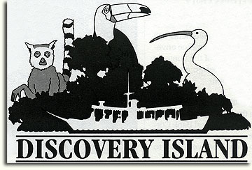
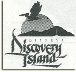
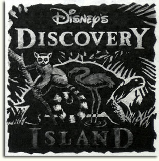
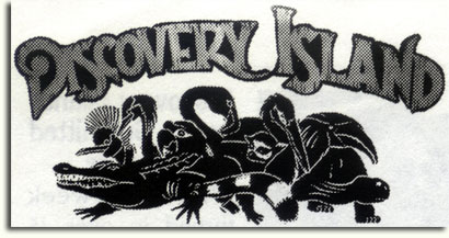
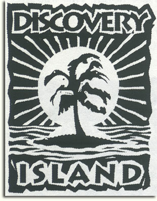
The following article and proposals for new Discovery Island logos come from an internal Imagineering publication from February of 1993:
Discovery Island Logos Submitted to Corporate
WDI this week turned in over 45 graphics concepts to Corporate in response to a company-wide call from Michael Eisner for a Discovery Island logo.
According to senior show producer Kathy Mangum, it all began in 1992 with Eisner’s annual tour of the Walt Disney World Resort. “During last year’s walk-through, Michael asked us to develop a new logo for Discovery Island,” she explained. “Julie Svendsen designed a wonderful logo which we all loved, and we presented it during his walk-through last month. This was after the very successful Mighty Ducks logo contest when Michael received 250 entries. He just loved that, so he wanted to try it again.”
About three weeks ago, the call went out and Imagineering’s graphics designers, show designers and concept designers [plus one architect] put pen to paper and ideas to computers, generating a variety of bold and striking renderings. After reviewing the submissions with Marty Sklar and John Hench, the Project Team turned in all of the ideas to Eisner. “There’s not a bad one in the bunch,” said Kathy. “They are very creative and some would look great on t-shirts.”
“Entries” from Imagineering, Animation, Consumer Products and other Disney business units were due to Corporate today. Eisner will review the submissions and pick the winner. “Hopefully, we’ll have some input since, unlike the Mighty Ducks, the Discovery Island enhancement is a WDI project,” added Kathy. “Of course, we’ll lobby for the WDI logos.”
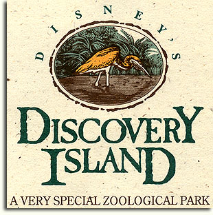
I don’t know if a “winner” was ever announced for the contest; by 1994, this was the logo featured on the Discovery Island brochure:
Sadly, Discovery Island closed in 1999; its furry and feathered inhabitants were transferred to the new Animal Kingdom park. It still sits unused today, slowly rotting as the jungle takes it over. I, for one, blame the logo – curse you, logo!




Clearly if Julie Svendsen had gotten it right the first time this wouldn’t have been a problem and we’d all be taking the water bridge to explore Discovery Island instead of renting a boat at Fort Wilderness to try to get an up-close sneak peek. Alas. I’m kidding. Once the Animal Kingdom concept was born, Discovery Island was doomed.
LOL I’m glad you brought that up, because I LOVE the implied burn to Julie Svendsen in the article. It’s so blatant. “Eisner wanted a new logo, so we had Julie Svendsen make a really awesome one and we gave it to Eisner and now we’re having a contest to come up with a logo!”
Poor Julie.
Indeed. Perfect in its subtlety…