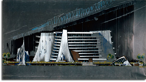
Today’s story on Progress City is somewhat unique and calls for a different kind of introduction. This, as you may recognize, is the Contemporary Resort Hotel – or is it? And if so, from when? And why?
For many years now, I’ve been trying to dig for information on this peculiar rendering by architect George Rester, an individual who did much design work for Walt’s original EPCOT city and the Walt Disney World resort. Sadly, the date has been cut off in my copy of the artwork, but the piece seems to depict an early concept for the Contemporary Resort Hotel – a concept that looks to be far more fanciful in its futurism.
I’m especially intrigued by the colossal statue sitting outside the hotel’s entrance, reminiscent as it is of the seated statues of Ramesses II at Abu Simbel. Who would have the statue been based on? Colossal Walt? Abe Lincoln? President GARCO? Who knows.
It’s interesting that this early concept – again, assuming it’s the Contemporary; it couldn’t be an idea for EPCOT city, could it? – actually looks far more “futuristic” today than the hotel’s final design. The swooping lines of the balconies, the mixture of curved and angular lines, and the various layers of recessed surfaces much more resemble Disney’s current take on futurism than the straight, mid-century lines of the actual Contemporary. In addition, the glassy, curvilinear outbuildings remind me of features of the early renderings for the Journey into Imagination pavilion.
One strike against this design, though – there’s no monorail!
It’d be interesting to see how this design fit into the evolution of the Contemporary. Unlike its counterpart the Polynesian, we’ve really only ever seen artwork for the Contemporary that shows it as it was eventually realized. It had to come from somewhere, right? Hopefully some day we’ll see more renderings released that will show just how early Walt Disney World development progressed.
And, strangely, if Disney ever wanted to build another futuristic hotel somewhere, they could look back more than forty years to Rester’s early designs.


Kid in a candy store. There is *so* much to explore regarding the early design work and development of the WDW resort concept. Great find, and proof-positive that there’s more to the story than land development and construction. I still think there’s a book to be written, with tons of artwork out there like this to be put on display.
This is a great piece of artwork…I would LOVE to know more about it.
It does, however, look a bit dystopian to me. Perhaps it’s the darker color scheme.
Great piece of art. Things like this always fire the imagination of what might have been, though I must admit a personal preference for the Contemporary that is. And am I the only one who wonders why they named the futuristic resort the Contemporary anyway? Contemporary means of the present; why not call it Disney’s Future Resort, or even Post-contemporary?
Kudos and thanks, too, for the great President GARCO reference.
It looks very “Atlantian” to me. A VTTBOTS officers club?…I expect the Seaview to surface by the entrance sometime soon.
This is a concept for a Disney Beach resort being designed in the 1972-1974 period. I think the statue was to be Neptune or Triton…….there was NO monorail connection to this. I will feature drawings and plans for this unbuilt resort on my Tomorrowlounge blog
Mike – That’s fantastic!! I can’t wait to see your post. I know that Disney had planned beach development in that era, but I never would have guessed that there was art, or that this was from that project! Thanks for the info!
Excellent article.
The conceptual design is very good
http://www.davidthemingworks.com/EN/