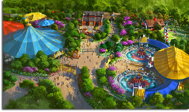
The official Disney blog has released new artwork for Florida’s Fantasyland remodel, and it shows a new and revised perspective on the Storybook Circus area which will be based on the film Dumbo.
This “mini-land”, which occupies the space formerly belonging to Mickey’s Toontown Fair, has always been defined fairly nebulously, and was one of the vaguest elements of the original Fantasyland announcement. As construction begins, the design has been refined, and while we don’t know many of the details we’re getting a better look at what the Imagineers are going for here.
Compare the new image, above, to the following artwork, which comes from the last major update we received:
One obvious thing you’ll notice is that in the new rendering, the budget for the area’s marquee has obviously been cut, because it’s nowhere near as massive as the one depicted earlier. Also missing is the calliope, which seemed to have been intended for this location. The replacement for the old Toontown train station, however, has grown more elaborate in the new artwork. It’s less “circusy” and more substantial, now being made of brick with a wooden annex.
Also less circusy is the Barnstormer queue, which was just a vague splash of big-top tents in the earlier design. Now, it’s clearly a refurbished version of the current attraction with a new color scheme. Recall that WDI seems to have considered several different thematic overlays for this kiddie coaster (once actually announcing a plan for it to be based on clowns), so it makes sense that its design was only locked after its final theme was determined.
The area itself has taken on a different aspect in the new rendering. It’s now not as spacious and open in its layout; the tents are huddled closer together, and a new small circular tent covers the formerly open area between them. Their colors are more vivid, as well. Disney has yet to announce what is actually in these large structures, but a shop and large dining facility are all but confirmed.
Recall that in early renderings, the Casey, Jr. Circus Train was used as a series of food stands? Well as we’ve known since the last release of artwork, the train will now be the centerpiece of yet another water-heavy play area for children. It’s now tucked between the train station and one of the big-top tents, instead of in a much more exposed plaza.
Overall, I’d say it’s looking good. I like the new color choices on the tents, and the area looks much more green and shady with trees than the earlier artwork. The less-sprawling plan better suits the material, I think; many of us thought that the circus hardly warranted a major themed area in the park, but this layout just seems like a nicely-themed enclave that will not draw more attention to itself than is warranted. It seems snug, which is much preferable to a giant, open area that would be yet another heat sink in the unforgiving Florida sun. It looks more inviting. The new train station seems far more “theme-agnostic” with regards to the circus, which is fine by me, and architecturally it looks nice – it’s not just a pre-fabricated steel overhang.
And is that water underneath the flying Dumbos? If so, that’s a design flourish we’ve yet to see in other renderings…
So hurrah for the iterative design process, and for making things better. Of course, if WDI wants to throw in a real Casey, Jr. train or Ward Kimball’s old Mickey Mad House, then who’s to say them nay?


It looks like the calliope is still there, next to the entrance to the blue tent…
I really like the more subtle flavor of the entrance, and having it offset from the main path coming from the Little Mermaid direction lends a more natural site line and transition to the area. Also the colors are RICH – vibrant, bold but still deep and warm – very nice. It’s weird because when they get their concepts wrong – like in the original renderings or say for instance the Toy Story Land for Hong Kong – you just know it’s wrong. When they get it right like these new concepts, it’s just right. You can feel it. And while I don’t get the tie in between Goofy, Dumbo, and Casey Jr., I feel the transitions from each part work well.
I believe it’s FoxxFur who has often (accurately IMHO) lamented the lack of water features in Fantasyland since the removal 20K… If there is indeed a water feature added to the new Dumbos, that would be a very nice and much needed touch. I still don’t think Dumbo (or the circus theme) deserves its own mini-land, but if they’re throwing in some water along with it, I’m much more OK with the area in general.
I kind of love the fact that they put Casey Jr. outside of a roundhouse annexed to the actual station!
I was actually surprised that Dumbo in Florida never had the water features as both DL and DLP do (unlike TDL which still has the older design).
Disney has yet to announce what is actually in these large structures, but a shop and large dining facility are all but confirmed.
Actually, it’s going to be a shop (Big Top Souvenirs, featuring the 3 Little Pigs as the Flying Piggolinis) and a character meet-and-greet area (Pete’s Silly Sideshow), like its predecessors the County Bounty and Toontown Hall of Fame.
Angular carnies? Carnies aren’t found at circuses, they are found a carnivals, hence the name! Circus workers are called roustabouts.
And the calliope is still there in the newer rendering, how could you miss that?
For shame, such silly errors! 🙂