The last time we spoke of Imagineer Tim Delaney was last year, when he departed Walt Disney Imagineering after thirty-three years with the company. Fans mourned his loss to WDI, as Delaney was a well-known name who had worked on a number of prominent and well-received projects throughout his career. I was glad to discover, then, that Delaney had landed on his feet and founded his own design studio. His website, which debuted a few months ago, provides a nice summary of his career to date and – even better – gives us lots of his fantastic conceptual art to view!
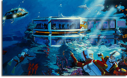
So before you drop in to check out his portfolio, here are a few of his pieces that I found most interesting. Delaney’s “break-through” came in the late 1970s with his well known conceptual renderings for EPCOT’s The Living Seas.
This rendering shows elements from the show and attraction originally conceived for the pavilion; this spectacular attraction was sadly abandoned when sponsorship problems forced Disney to cut the budget. Delaney’s rendering for Seas were so evocative and exciting, that the actual pavilion wound up being something of a disappointment when it actually debuted in 1986. An engineering triumph, to be sure, but nowhere near as expansive as Delaney’s original imaginative concepts. But that’s not all that he worked on for EPCOT.
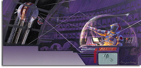
This exciting rendering shows the Future World section of EPCOT Center as it was envisioned in 1978. I love the energy in that piece. Delaney also did some conceptual work for EPCOT’s never-built but long-lamented Space pavilion.
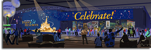
Other key projects that Delaney worked on at WDI included Discoveryland at Disneyland Paris and Tomorrowland at Hong Kong Disneyland. He developed concepts large and small, including the much-lauded Disney Parks and Resorts exhibit for last year’s D23 Expo.
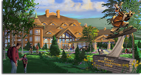
But you know what we’re really interested in – the attractions that never made it off the drawing boards. The blue sky concepts. The sneak peeks of possible future attractions. Here are some of my favorites from Delaney’s site. First, the projects that never came to be. Delaney worked on several of these, including resort hotels…
This resort, which I believe is one of the various Disney regional resorts that had been considered, is called the White Mountains Lodge. According to Google, there are White Mountains in both Arizona and New Hampshire; the New England setting better fits the summer and wintertime views that Delaney envisions.
One of the most prominent projects that Delaney worked on before he left Disney was the famous pirate-themed expansion for Hong Kong Disneyland. This vast area would have been a “mini-land” addition to Adventureland, with several rides deriving their themes from Pirates of the Caribbean. The area would have possibly included a variation of the Haunted Mansion, and of course a new iteration of the famous Pirates of the Caribbean attraction. This version of Pirates would have been more thrilling than previous incarnations, though; with no plans to bring Splash Mountain to Hong Kong, the new version of Pirates would have incorporated elements of that flume attraction and ended with a massive drop. And I think it would have gone a little something like this…
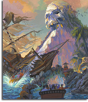 Guests plunge from Skull Rock in this concept for Hong Kong’s flume-based Pirates of the Caribbean attraction
Sadly, Hong Kong officials nixed this expansion. It would have been nice…
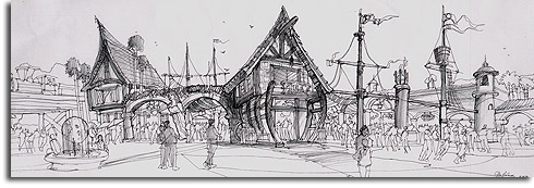
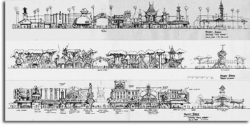
But Delaney’s site also gives us a glimpse of what the future might hold, with concept art from 2008 for Shanghai Disneyland – some of the first development art we’ve seen for the park. Here, Delaney shows a few of his concept for the park’s Main Street area:
While these concepts probably differ greatly from what we’ll actually see when the new park (codenamed “Project Bueno”) opens later this decade, they at least give us an idea of what is being considered. For one thing, many have questioned if the new park will be a traditional “kingdom” style design. While these designs are certainly different from previous Main Street areas, they do indicate that the park will have a somewhat similar layout with a town square, Main Street, and Center Street.
The top sketch shows a Hollywood-themed Main Street, with the various traditional Main Street amenities themed to appropriate Hollywood landmarks. The arch over Center Street indicates that it leads to the “Walt Disney Studios.”
The center sketch shows Main Street as a “Forest Village”, with a fantasy-based enchanted forest feel. The bottom sketch depicts a “Whimsy” Main Street, with various far-out designs more reminiscent of Downtown Disney. Interestingly, Center Street in this design provides a “view to Hyperion Theater.”
One of my favorite designs is this imposing suggestion for a new Space Mountain, from 2008:
That’s just a taste of what Delaney has on his site; head over and check out the rest, including more fantastic work on projects both built and unbuilt. And a few things that are mysterious but simply very cool…
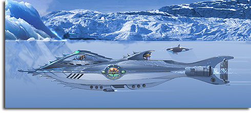 I’ve no idea if this design for a “new Nautilus” was for any specific project, but wouldn’t it have looked cool in Hong Kong’s unbuilt Glacier Bay?
Good luck to Tim in all his future projects!







A lot of the Disneyland Paris photos featured on his website were donated by me on Tim’s request.
Michael, aren’t those Project Bueno concept renderings for DCA’s now to be called “Buena Vista Street”, not Shanghai Disneyland – hence, “view to Hyperion Theatre”??
RS: I actually thought that too at first glance, but then thought about the following:
1) In the sketch, “town square” is to the right, and the shops are laid out from right to left exactly how they would be in Disneyland leading towards the castle on the left. This is a mirror image of how it would have to be set up if the Hyperion was to be seen through Center Street.
2) The shops mirror almost exactly those of Main Street USA, including the Magic Shop and Cinema. I doubt they’d duplicate all of those in DCA.
3) The drawing is dated to 2008, which is after Buena Vista Street was announced.
4) I managed to dig up the fact that “Project Bueno” is one of the code-names for the Shanghai project.
Don’t worry, I picked over the images thoroughly before I went out on that limb
Excellent detective work. I think that makes it the first confirmed Shanghai art I’ve seen.
[…] is just another "reason" to hold on… Concept art by Tim Delaney. Image brought by Progress City, U.S.A. The above image showcases the climatic ending of a re-designed Pirates of the Caribbean attraction. […]
Thanks! It’s the kind of nitpicky research that I love. And yes, this is the first known Shanghai artwork that I’m aware of, too. Aside from the famous Annual Report image, which may or may not have been for that…
Absolutely amazing stuff here!
Isn’t it great? He’s so good… such great artwork.
[…] Crawford at Progress City, USA takes a look at some fantastic artwork by former Imagineer Tim Delaney. Michael is also celebrating the life of Herb […]
[…] http://progresscityusa.com/2010/06/28/delightful-delicious-delaney/ […]