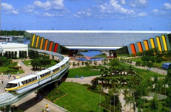
The Universe of Energy, as it was in 1982:
Lovely, eh? It’s almost like a geologic formation itself, jutting from the ground with its dynamic and energetic hues. Those original WED art directors knew what they were doing – people like Claude Coates and John Hench knew a lot about the psychological effect color could have on people, and used it to great effect in the original EPCOT Center. Then, in the mid-90’s, this happened:
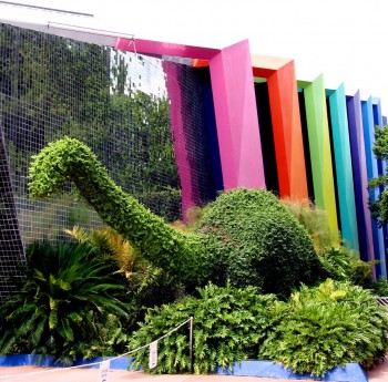
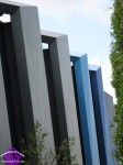
With the advent of Ellen’s Energy Adventure, the pavilion exterior became something of a pastel nightmare. The previously colored areas were painted a dark navy, and the previously neutral “ribs” that bordered them were painted various clashing pastels. Until roughly last week:
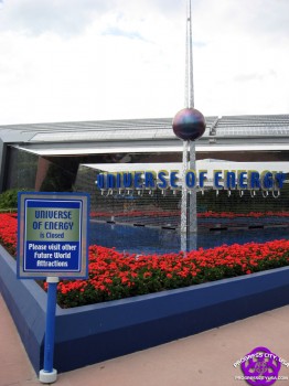
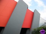
It was known for a while that the Universe of Energy was going down for a rehab in order to upgrade its ride system and to receive a general sprucing up. But what was not expected was that WDI would take that opportunity to return the pavilion to its original, proper color scheme.
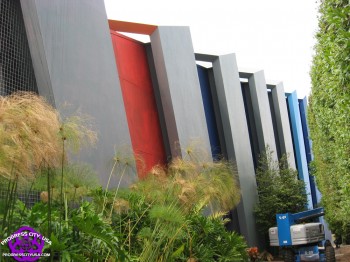
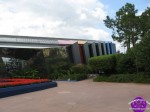
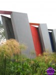
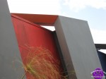
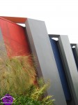
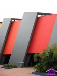
The west side of the pavilion was the first to receive attention, and appears to be mostly complete. It’s unknown whether this area is just primer or will get another coat later. Note that the “ribs” have been returned to their original color as well. As of last Friday, the east side was still being worked on:
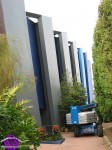
Note that some of the pastel areas remain on the east side, and painting had only begun on the formerly-navy spaces between the ribs. It seems that the painted orange area on the east side is only primer.
While someone on one of the message boards pointed out that it’s a sad statement about things that all we have to get excited about is a paint job, the fact of the matter is that it is exciting to see the pavilion return to its original colors. It’s the little things like this that need to be done to start EPCOT on its road to recovery. I’m not sure who made the call on this decision, but my hat is off to them. Well done.
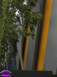
My only hope is that they continue with this work, cutting away the trees that have grown up around the pavilion and that conceal its exterior. The paint job should then be continued all the way to the back of the pavilion – it’s unclear yet whether the full “spectrum” from red to yellow will reappear on the pavilion’s exterior; at the moment it looks like some areas towards the rear of the pavilion remain painted dark navy.
And once Universe of Energy is returned to its original glory, what then? I fervently hope that Journey into Imagination is next; it’s 1990s repainting is even more horrendous than Energy’s. And although it’s a more recent change, the Seas building really should be returned to its original color scheme as opposed to its rather bland and unsightly blue repaint.
For now, though, at least we have Energy! Good job, guys.
More pictures below the fold











wow – this is really good to see! I have a feeling we’re going to see a full (but still, maybe slow) transformation of the park back to what it used to be. I also have a hunch that Horizons is coming back in some form or another…soon.
I’m not sure if it’s the modern cameras or the paint they’ve used, but, repainted “original” colors look more cartoony and plastic-y than the original colors.
Mike: It actually looks really good in person, although it definitely doesn’t use the same spectrum gradient as the original design. That’s why I hope they aren’t done yet – it just kind of goes from red to yellow without that nice smooth change.
Matt: I hope so… as I said, Imagination and Seas would be the place to start, as well as Communicore/Innoventions. A repainting of that area and the removal of all the extraneous clutter would make that area much more welcoming. As for Horizons, well, even I’m not that optimistic… but man, it sure would be nice.