 As stated by Tangaroa so eloquently in his previous blog, Disney has gone overboard in promoting their parks as one identity, and we could really give two cents. In fact, it strikes me as uncreative and cheap (although I like the pictures). When Walt Disney World opened, Disney realized that a bulk of their guests were first-timers, and marketed to them. Disneyland was always much more the regional park of the two, with tons of locals coming in over and over again.
Strategies for promoting these parks became quite different even before WDW became the younger sister to its Aneheim predecessor. Imagineers wanted to make the parks different – vast spaces and soaring spires in the Magic Kingdom versus intimate detail at Disneyland, but also entire new attractions and lands. Fantasyland dark rides based on Peter Pan, Snow White, and The Wind in the Willows (Mr. Toad) were to be replaced by Mary Poppins, Sleeping Beauty, and Sleepy Hollow (Ichabod Crane), respectively. That plan was cut early by Roy O. Disney due to budget concerns. Gone was New Orleans Square, as New Orleans itself was clearly too close to Florida to be seen as exotic, as was its defining attraction, Pirates of the Carribean. In its place went Liberty Square, another detailed land with its own Haunted Mansion and a completly different feel.
The Pirates equivalent of course was supposed to be the Western River Expedition, a part of the giant Thunder Mesa complex that made it onto park maps at one time, but never off the drawing board. Brian Martsolf has an interesting site dedicated to Walt Disney World in postcards, and pre-opening the marketers at Disney decided to bet on difference from Disneyland to push their product. There are postcards of watercraft on giant bodies of water (in relation to any at Disneyland), resort hotels, and recreation.


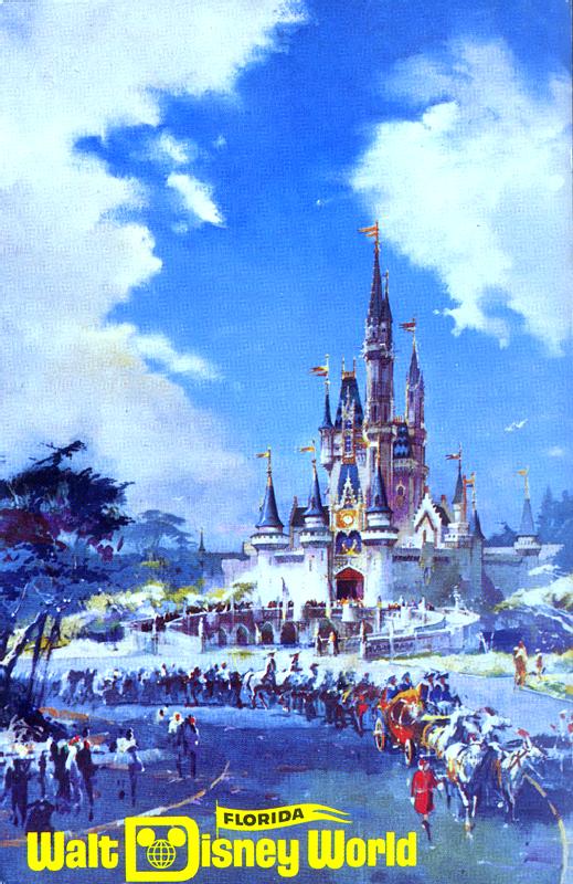 Looks fun. As for the theme park equivalent of Disneyland, there were only three postcards for the Magic Kingdom. Of course there had to be one with the castle, but this painting by Herb Ryman emphasises the scale difference of this castle to Sleeping Beauty’s. Note the procession in front of the castle, and the distance used as per the standard view of Disneyland’s castle. Disneyland guests are always shocked at the scale of not only the castle itself, but the breadth of the hub in general, and this picture clearly captures it.
As for the other two postcards, there’s one with the new land Liberty Square (not exactly a blockbuster attraction pictured here).

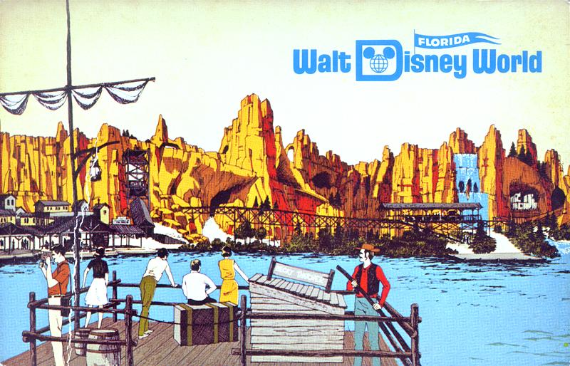
The other? A view from a Tom Sawyer raft of Thunder Mesa, which made it onto park maps and postcards but never off the drawing board. The folks at Disney must have been pretty sure that this was going to make it, and if you’re interested about why it didn’t, you should read this Jim Hill article about the long process of this attraction’s death.
Regardless, the folks at Disney were not that eager to rely on touchstones for their marketing for WDW. In fact, it appears quite the contrary – that they looked for a different product to promote and new challenges to tackle.
Unfortunately, in the post-Walt era, this thinking vanished for the most part. Tokyo Disneyland was in large part a copy of the Magic Kingdom in Orlando, and though the dream of Disney lived long enough to make EPCOT anew as a respectable theme park, and Eisner built Euro Disney with an eye for quality, this form of thinking does not seem to have much legs at Disney anymore.
Eisner wanted every property to be a “resort” like WDW, including hotels and second gates. The Disney Studios and California Adventure show the budget cut agenda, cutting corners on quality while taking wholesale attractions from other parks, namely the Disney MGM Studios. Recent popular attractions, such as the Tower of Terror, Buzz Lightyear, Pooh, even the mountains Splash, Space, and Big Thunder have been sent around the world in near identical versions.
Now, with the Disney Parks ad campaign, it is clear that the folks at Disney marketing want to consolidate even further, refusing to admit the difference in the Resorts’ drawing power and demographic, and the differences and advantages of each particular resort. Obviously they are trying to establish more “brand essence,” Disneyspeak for a corporate image. But perhaps for once, they should develop more individual resort identities.




I must disagree on your assessment of Liberty Square. There are 3 attractions there. The Haunted Mansion (not to be sneezed at), the Hall of Presidents (although have had to boycott it for now almost 8 years) and the Liberty Belle paddlewheeler which takes passengers on a cruise around the Rivers of America, which can be treacherous at times. Don’t forget the Liberty Tree Tavern with it’s tasty American fare. Sitting out front is the Liberty Tree itself, which harkens us back to the 1957 Disney treat “Johnny Tremain”. AND, if you just want something light, the Toll House Cookie place is always tasty. Obligatory picture in the wooden pillary or watching the parade pass, the Liberty Square is not to be sneered at.
Agreed.
Sponsored by Stouffer’s, too…
I also wonder if anyone at WDI still thinks about WRE every now again again… there sure is a lot of empty space on the north side of Frontierland…
Great article.
Don’t forget that the Bi-Centennial was fast approaching when they were building the Magic Kingdom. Liberty Square was a great tie-in and the closest we had to getting Walt’s Edison’s Square.
As much as I love Pirates, Big Thunder and Splash; the Western River Expedition would have been amazing.
Keep up the great work on the blog. I am really enjoying it.