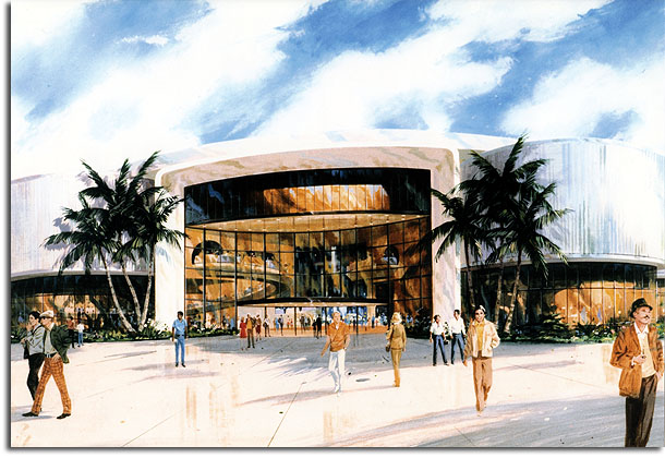
We recently showed a picture of the Epcot model from 1978, which included the “Transportation” pavilion that would later become World of Motion. I’ve come across this rendering of that same pavilion, which I believe to be by Imagineering artist Collin Campbell, and I thought it would help to shed a little light on that earlier design for the attraction.
The Transportation pavilion was the first of the Future World attractions to find a sponsor, and it was the backing of General Motors that helped give Disney C.E.O. Card Walker the confidence to move forward with the Epcot project in October of 1978. Early concepts for the show building mirror the eventual attraction’s cylindrical shape, but you can see in this early rendering that the original concept was for there to be semi-circular “bumps” extending from the perimeter of the building. The atrium at the building’s core was, for a time, meant to be enclosed by a glass wall, and you can see that the ride’s omnimover vehicles were to pass in and out of this atrium several times. In the final attraction, of course, vehicles would make a single loop through an outdoor atrium before entering the show building.
Hopefully, we can find out more about this interesting early take on Transportation in the future…
Oh, and also – I’m a big fan of this guy:


“Vel vee made zuh BMW and zuh Porsche… an vat did zay do mit all dat american ingenuity? zuh Corvair….”
I almost prefer the design used in this rendering. It seems more interesting from a formal standpoint, like there’s a lot more going on, and it’s cool that you can see through the glass wall how the different cylinders intersect.
Not that it would have mattered anyway, considering it would all be blocked by giant scaffolding in 1998…
I had not considered that the German fellow might have been there to scoff at the GM cars. If only there was a painted Orson Welles in the background to mock cuckoo clocks.
Adam: I do like the glassed-in entrance with all the activity behind it. I hope to someday figure out what was going on with all those loops. I’ve seen pictures of the model with the roof off, and there were obviously show scenes in there, so this wasn’t just “blue sky”.
And yeah, I’d be pretty happy if we could get rid of that freakin scaffolding. I’m not a fan.
Wow, look at all of those single adult males wandering EPCOT. And the two fellows paired off on the left have me wondering what type of undercover intrigue they might be getting up to.
I really love the paint colors here as opposed to the deep red and blues they ultimately went with; way more than what’s there today, of course.
I’d swap checkered pants and international spies for angular kids any day.
I’m not usually an armchair Imagineer, but something like this really gets me thinking that a significant horticulture and landscape design budget is necessary for Epcot, especially on the East side. Talked about before, I know, but the entire area all the way around Odyssey is just plain depressing.
Then again, would it have killed Campbell to include a bench? Reflecting pool? Perhaps some shrubbery? This late 70s Epcot stuff cracks me up, because it’s all so functional and intentionally business-oriented. Serious stuff is happening here. Certainly a far cry from an amusement park and it’s zippy rides, modern scaffolding and Kool Zonezzzz.
Great find….
As Adam says, this just reinforces how truly awful the Test Track scaffolding is. The sleek purity of the WOM building may have briefly gone out of fashion, when the 80s entered the rear-view mirror, but I think now it would seem timeless. Much like how Spaceship Earth has been restored to its wandless beauty.
Maybe all these childless adults are coming out of the executive club lounge.